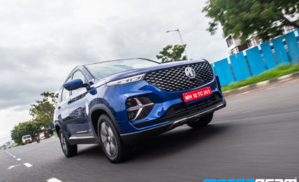
We do a quick spec comparison of the Gravitas with the Hector Plus before these cars are officially launched here.
When Tata and MG took their products, the Harrier and the Hector to the battlefield, that was the sales chart, it was the Hector that came out victorious. But Tata is not backing up. They retaliated with the 2020 Harrier with a slew of updates that has addressed almost all customer and critic complaints and have added more power for good measure. But today is not about these cars. Today we are here to see how the upcoming 6/7-seater versions of these cars stack up against each other.
Exterior –
Tata Gravitas
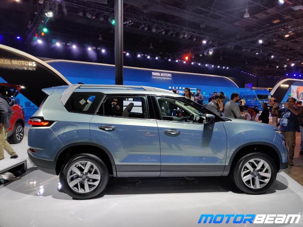
Take a quick glance at the Tata Gravitas, and you might mistake it for a Land Rover! The car certainly resembles the SUV it’s based on. The front has not changed much, except for a new grille, and some chrome elements. Come to the side, and the design is certainly not perfect. The extended rear does not look as well polished as the rear of the Harrier. This is mainly because of the fact that the extra window panel attached to the car does not flow with the window line of the car, and that bulge in the roof for more headroom.
There are actual changes to the dimensions of the car. Unlike the Hector Plus, the car has been made longer to accommodate the rear seats. The wheels fit quite nicely, and the roof rails that appear to melt down to the rear of the car give it character. The rear has also seen some changes. Mainly, it’s boxier. The tail lights see a change too, swapping straight lines with curves. The car’s design is simpler as compared to the Hector Plus, and would certainly appease certain buyers.
Overall the design gives a feeling that the Harrier has become more confident of it’s Land Rover identity, and is embracing it now.
MG Hector Plus
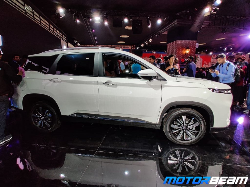
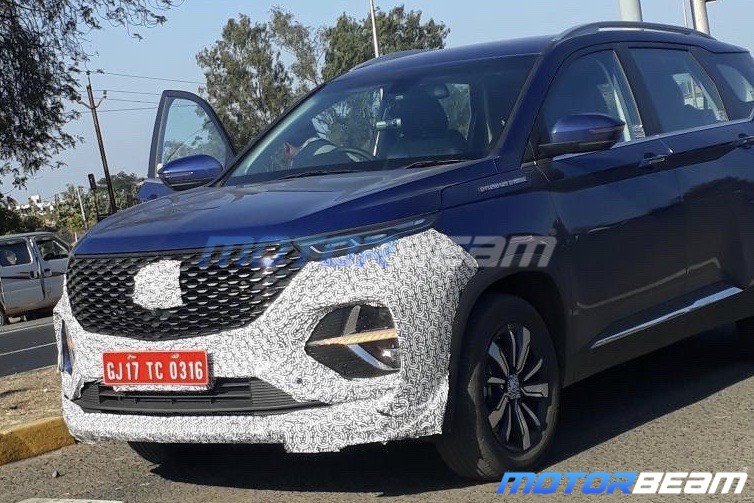
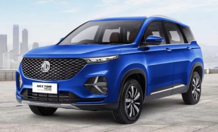
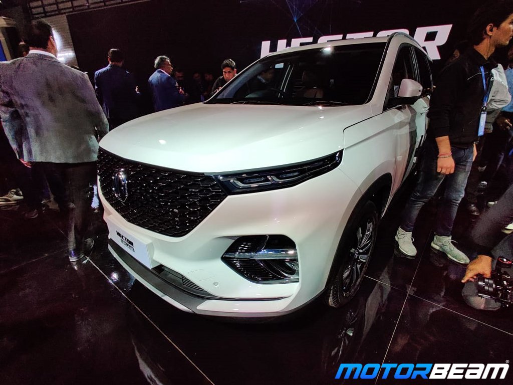
The MG Hector plus remains largely unchanged. The Hector plus is not a plus-size version of the Hector, it just gets more seats. To distinguish it from the regular Hector, MG has reworked the bumpers and cleaned things up a bit. The stop sign looking reflector panel has been removed at the rear and looks much cleaner now. The wheels stay the same, so does the side profile. MG has reworked the lights though. The front light assembly is now fully integrated, and the DRL assembly has more intricacies in it. At the rear, the tail lights get transparent touches, making it look a lot like the Toyota Fortuner’s tail lights.
The bottom line is that the MG is more sophisticated and for some, perhaps a little busy, and the Gravitas is more simple. It’s highly suggested that you have a look at both cars in person before concluding, as pictures don’t tell the full story of the car’s looks, especially in terms of proportions.


