Conclusion
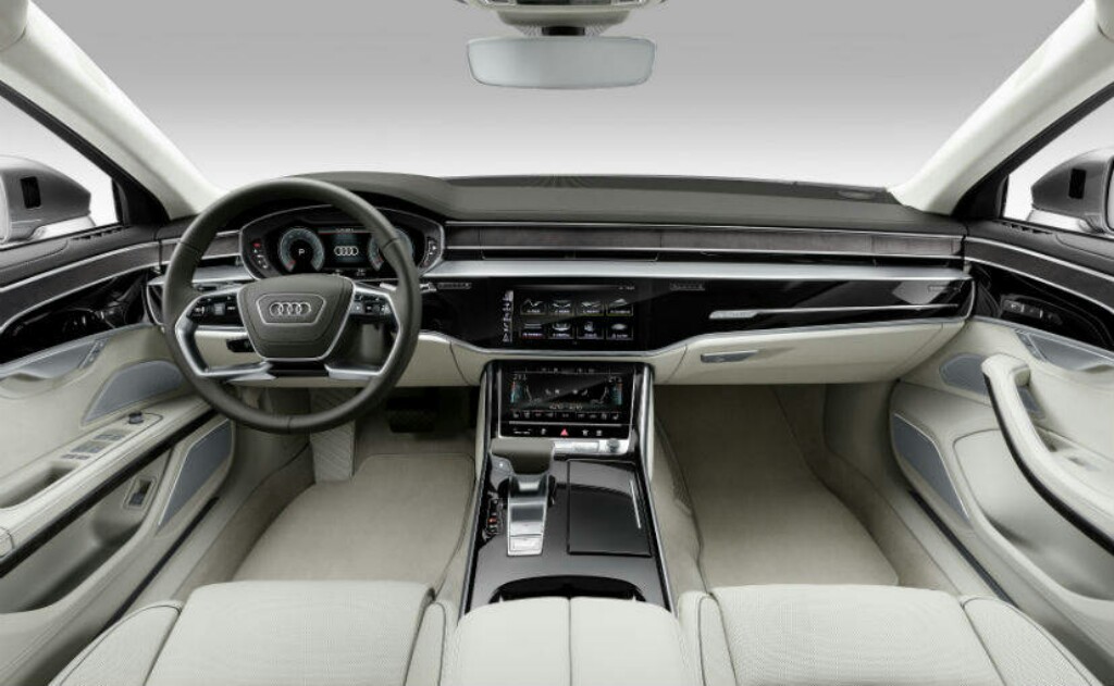
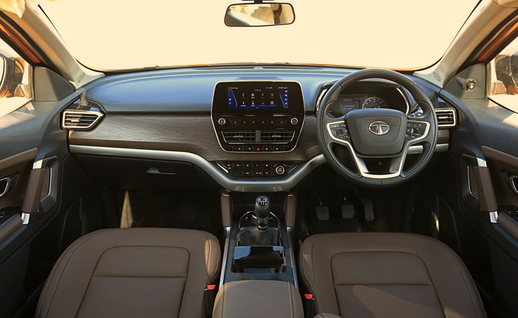
Designs of interiors need to look good, obviously, but the looks should not take precedence over function and usability. Now I’m not saying we should have stuck with buttons and dials. I’m saying that these infotainment systems of the current day and age are becoming cinema screens instead of a useful tool.
Coming to the question. Do we really need large infotainment displays? In the current generation, I don’t think so. It’s important to look beyond the cool factor of any feature, and actually, see what it brings to the table. And in this case, all I can see is another large sheet of glass one has to worry about not breaking. The extra screen real estate is not needed as of now and only adds inconvenience.
But part of the journey to new technology is the inconvenience caused by the switch. The industry, especially higher up the price spectrum wants to switch from buttons to displays. Workarounds are already being developed like voice assistance, gestures, etc. to make them easier to use. It will be interesting to watch how companies make them better to use while driving.
